
SPINEX
UX/UI & Development


 branding
design
UX/UI

Color after color
Whether you want a completely new brand image or just an update, we create something memorable. Not only for you but also for your target audience.
Vibratingly or softly captivating creatives, brand- and platform-oriented design and all-size UX/UI, with which we maximize the user experience on all surfaces.

UX/UI & Development
Complete rebranding
Open-air mega exhibition in Győr
FEHOVA - exhibition creative
AGROMASH - exhibition creative
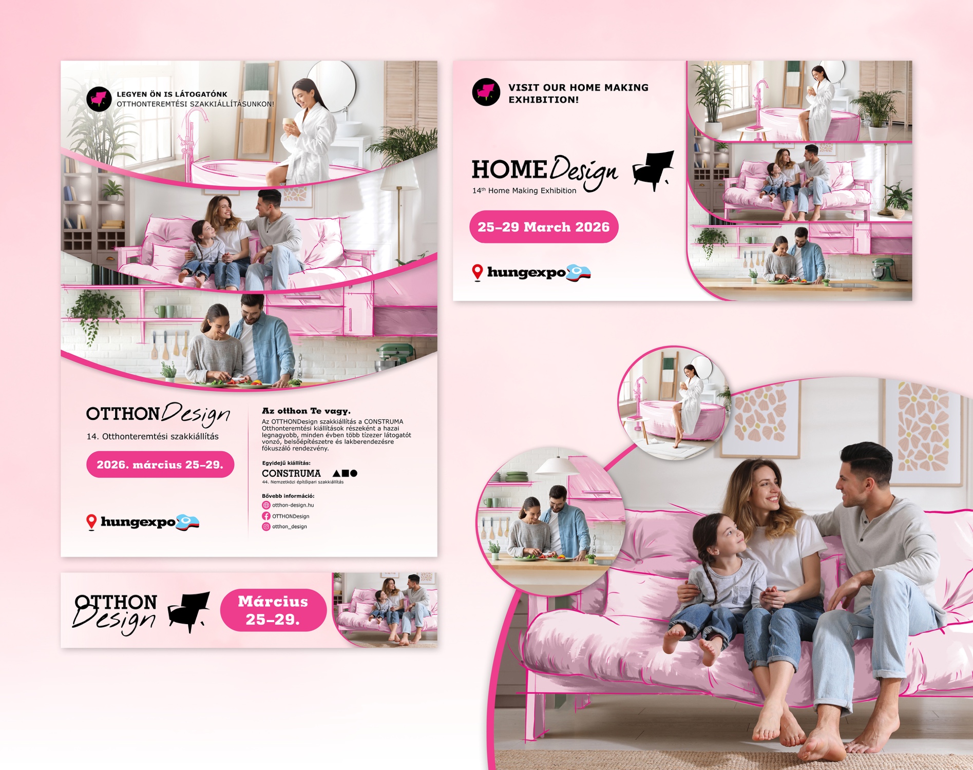
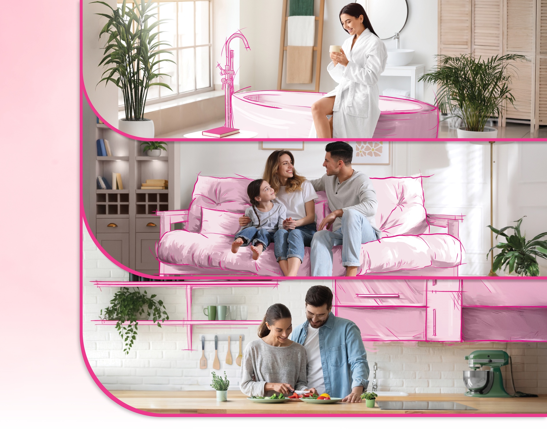
OtthonDesign - Exhibition Identity
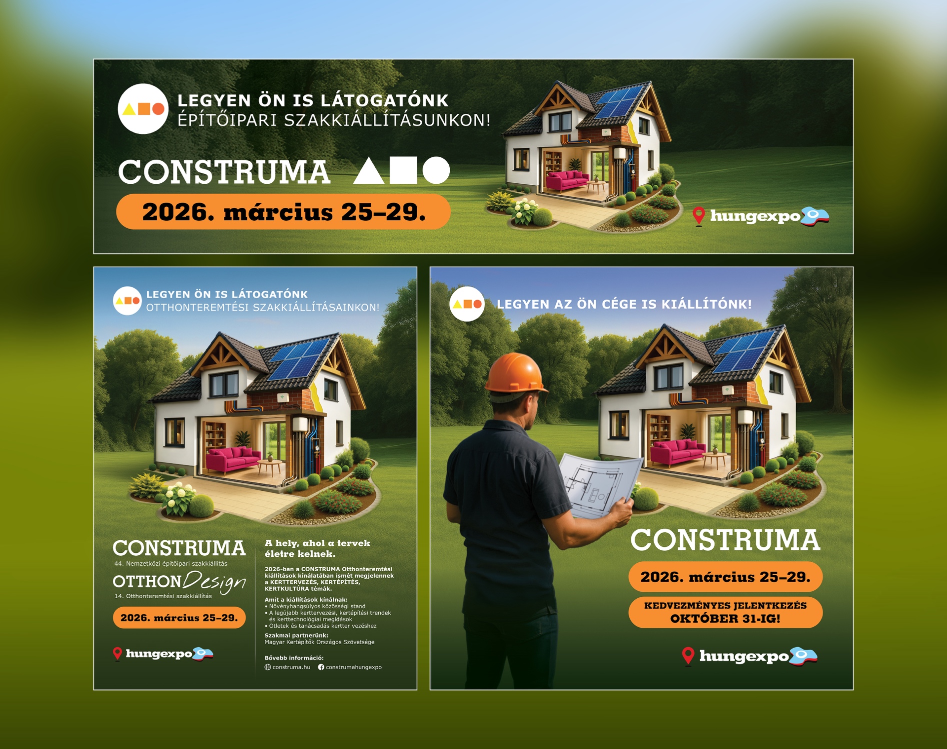
Construma - Exhibition Identity
Half the World's Eyes are on Us
Autotechnika Brand Refresh
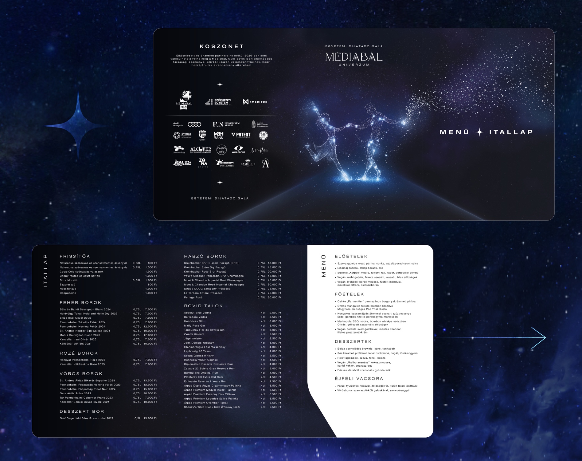
Media Ball - Széchenyi István University Sponsor Ball
Autotechnika.hu UX/UI
MOD UX/UI

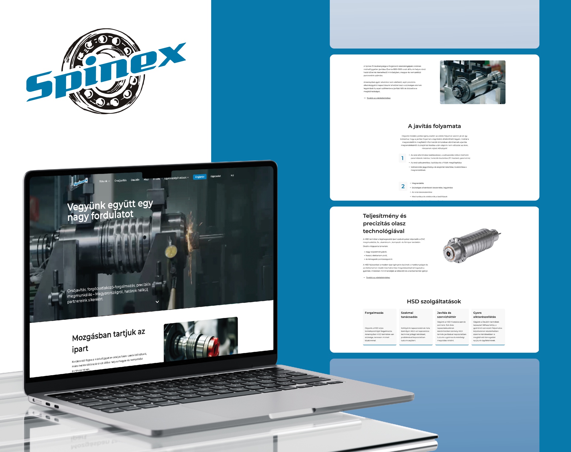
The task.
Replacing Spinex's previous website with a modern, multilingual, fast and service-focused platform.
The implementation.
A new, clean information architecture was created to clearly present the company's complex services. The website was optimized for multilingual operation, with special focus on speed, technical stability and future scalability.
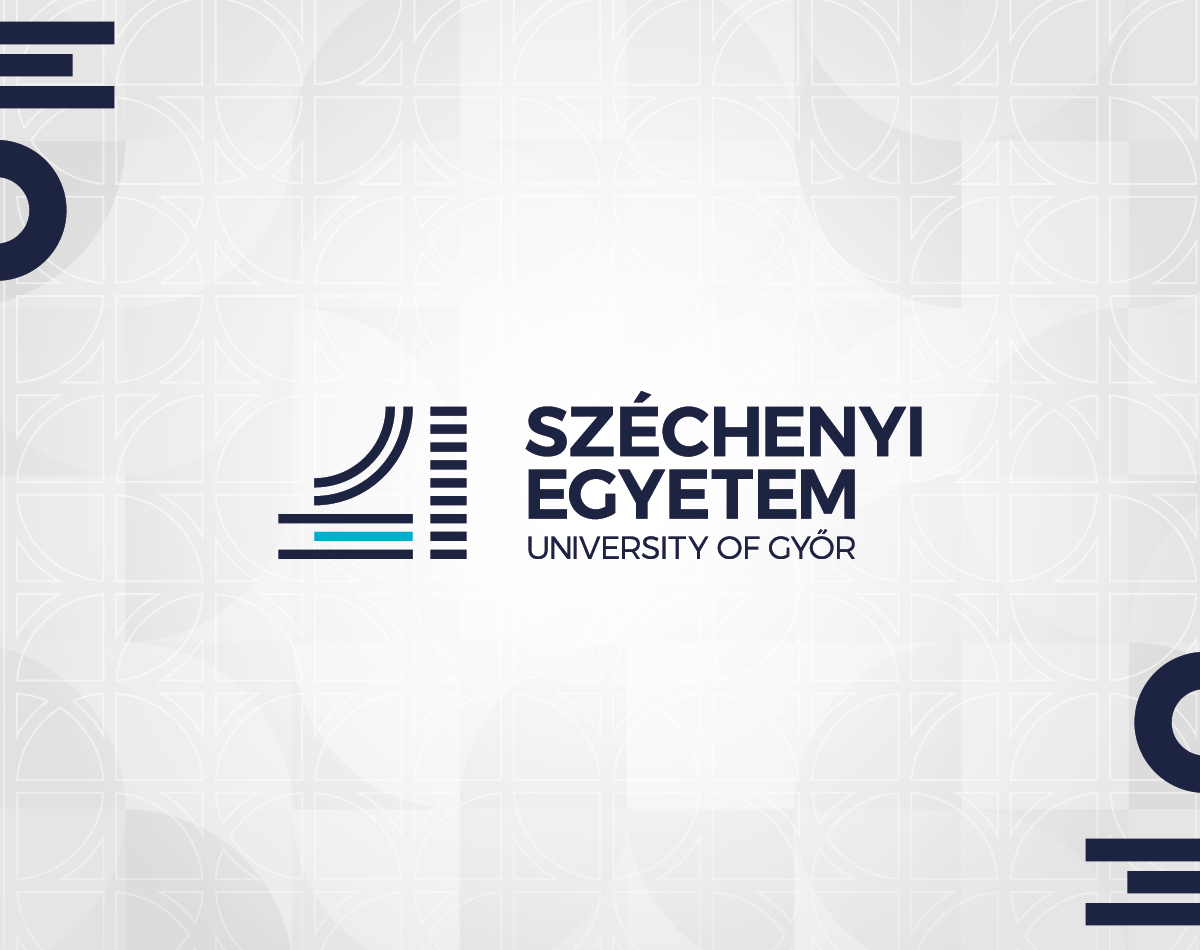
The task.
The time has come for the institution, expanding over time with multiple disciplines and new faculties and gaining strength internationally, to refresh its branding.
The implementation.
The new branding, rooted in tradition and values, including the logo, symbolizes the university, the institution's internationality, the city, and nature alike.
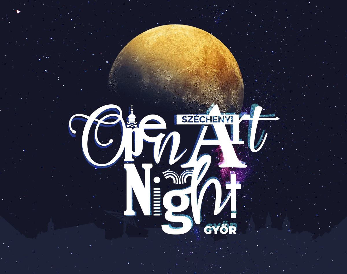
The task.
Even during the pandemic, we were hopeful to 'take' art to the people.
The implementation.
After dark, in multiple locations, we played with darker shades of blue and warm colors using the projected material's light play, conveying the event's message.
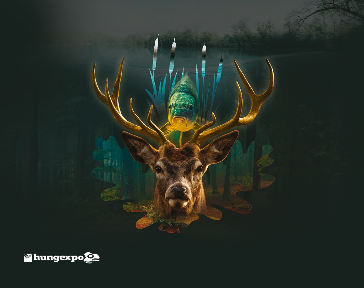
The task.
With HUNGEXPO's exhibition creatives, based on the theme of the year, we aim to address the exhibitors, professionals, and visitors simultaneously.
The implementation.
Creating key visuals and mutations whose messages hit the mark in every element of the integrated campaign.
The task.
With HUNGEXPO's exhibition creatives, based on the theme of the year, we aim to address the exhibitors, professionals, and visitors simultaneously.
The implementation.
Creating key visuals and mutations whose messages hit the mark in every element of the integrated campaign.
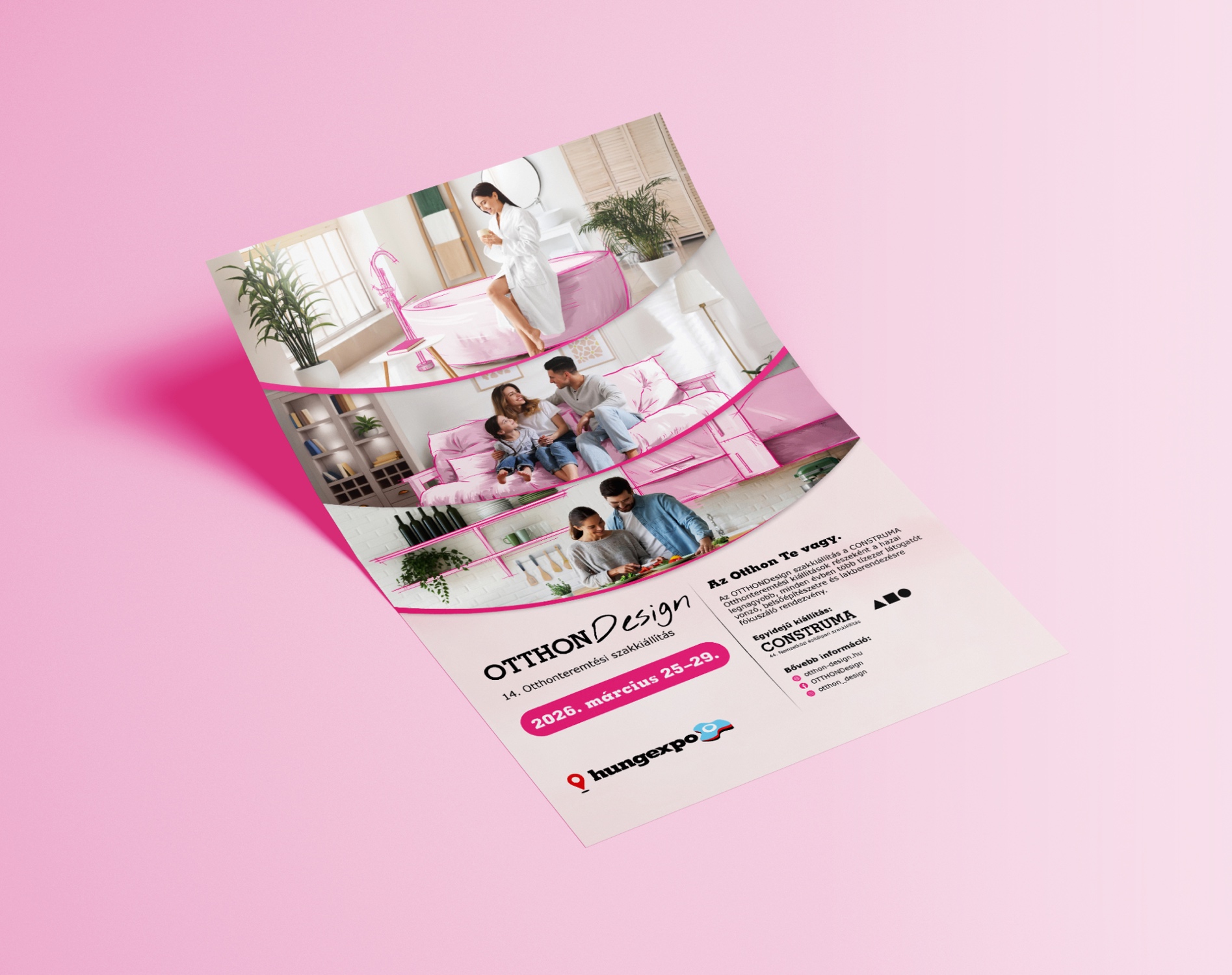
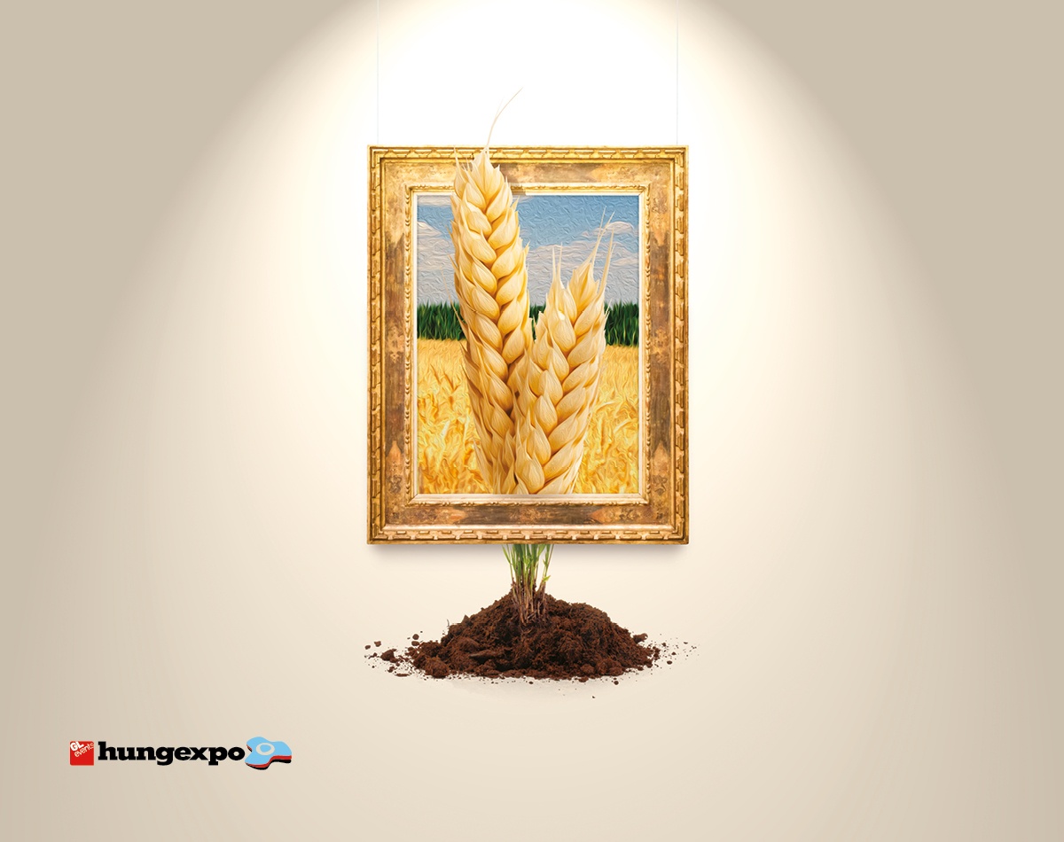
The task.
Based on the annual theme, the creative concept was developed to simultaneously engage exhibitors, professionals and visitors.
The implementation.
We created a visual concept that is both inspiring and easily adaptable across print and digital platforms. The creative system appears consistently across posters, online banners and other communication tools, with a strong, recognizable visual character.
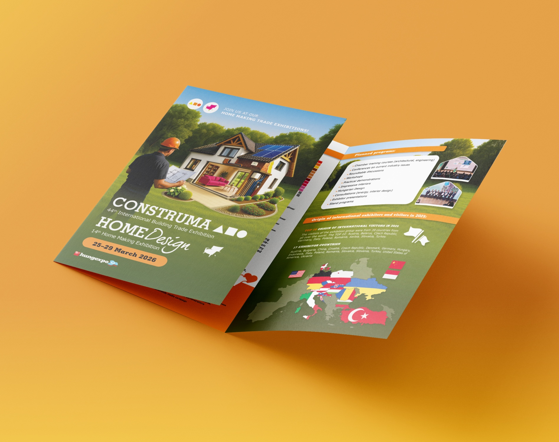
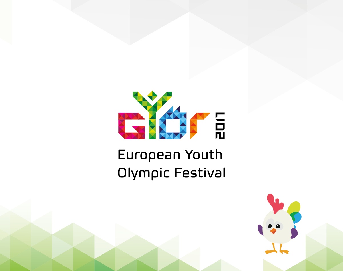
The task.
In 2017, Győr hosted the European Youth Olympic Festival (EYOF), for which our agency was responsible for logo and medal design.
The implementation.
The logo's color represents the cultural diversity of the city and the event. The formal elements depict the multitude of small steps leading to the goal, while the 'Y' symbolizes the rising Y-generation with its optimism and boundlessness.
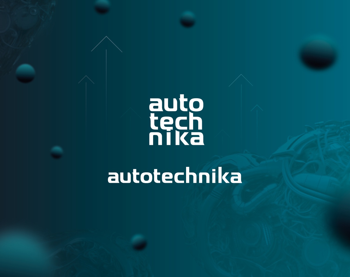
The task.
Full brand refresh for Autotechnika reflecting the current and future trends in the automotive and maintenance industry.
The implementation.
The industry driven by digitization and e-mobility was the focus during the brand update, resulting in a modern, minimalist design optimized primarily for digital platforms, which also received a fresher shade of green in its color palette.
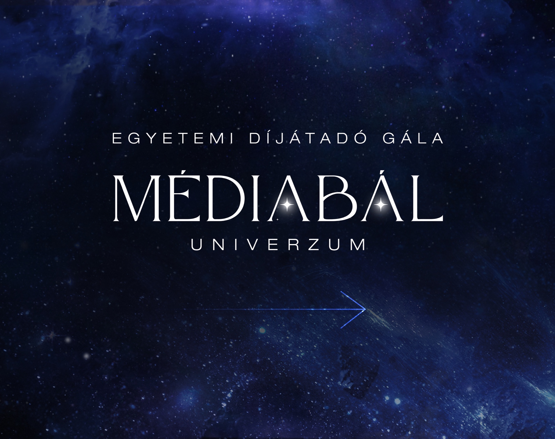
The task.
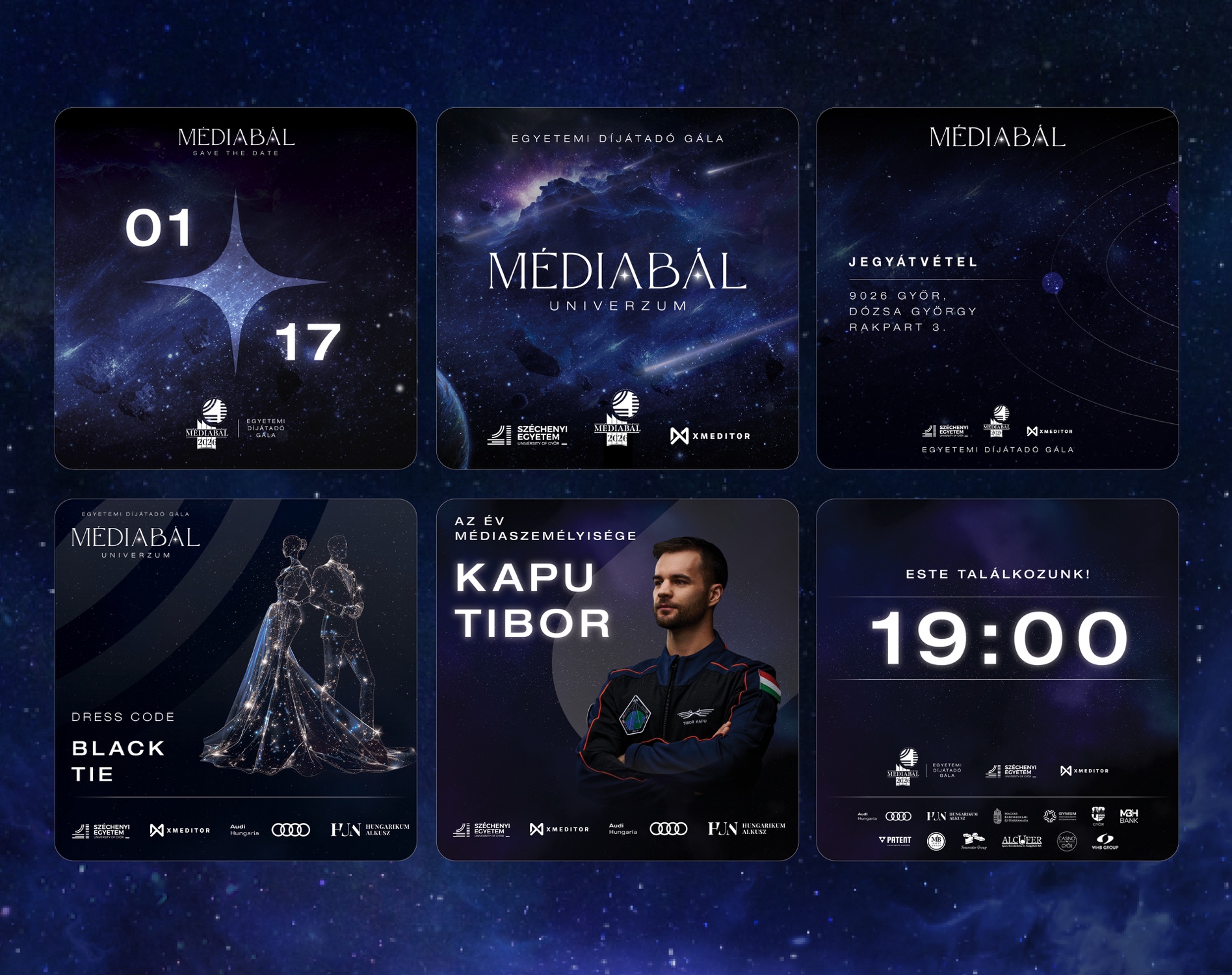
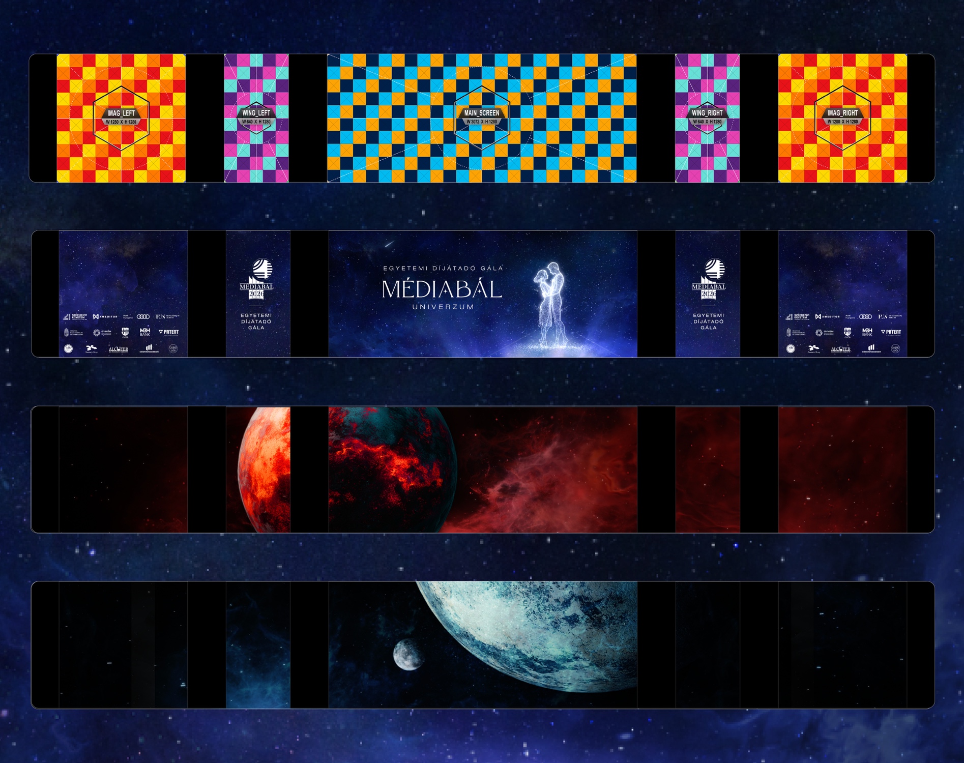
Design and execution of the annual ball's complete visual identity based on the given yearly theme.
The implementation.
Each year, the identity is developed to work consistently across both print and digital platforms. The most spectacular element of the project is the LED wall visual, featuring increasingly complex 3D animations and cinematic content year after year.
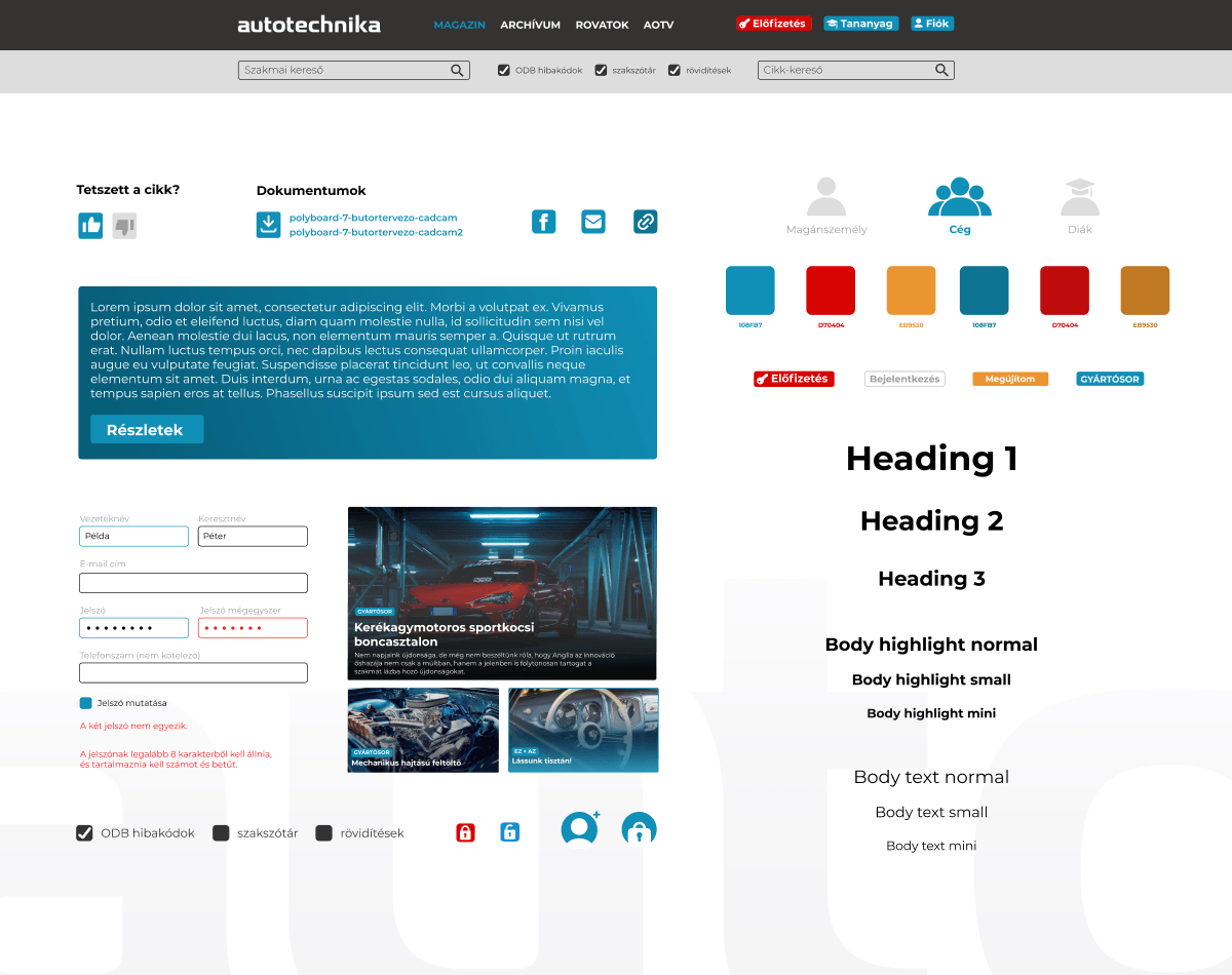
The task.
Given the reader and subscriber patterns, a stronger online presence is warranted, necessitating adjustments not just to the magazine, but the portal as well.
The implementation.
Our portal was renewed not just in appearance but also in functionality, providing easier navigation as well as new subscription and purchasing options catering to varying needs.
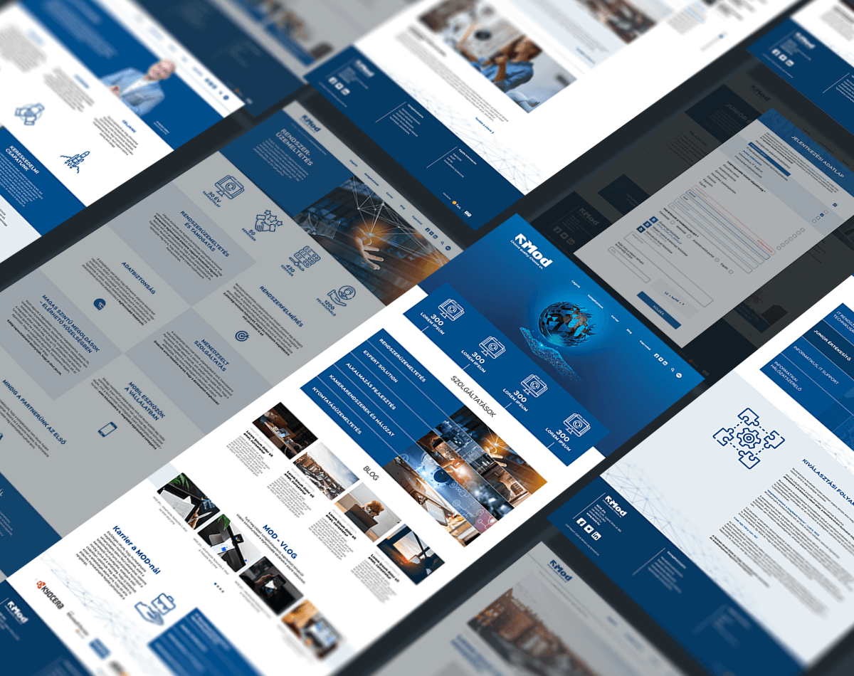
The task.
An IT company without a strong website is like a one-armed giant - the task is clear.
The implementation.
We repackaged our IT partner's online appearance, where beyond business services, blog posts and video content also increase the longstanding company's traffic and credibility.
brand activity
content
campaigns
What will I be when I grow up?
Posts dominating feeds, copies fighting in headline blocks, platform-specific appearances, or national integrated campaigns spanning those platforms.
This is what every brand deserves, depending on the target audience!
When it comes to commitment, gift-giving shouldn't be problematic any more. Whether it's about employee rewards, customer evaluations, or even exhibition or other events, you don't have to give up on last-minute ideas.
Road Safety Campaign
Road Safety Campaign
Full-Service Brand Communication
Brand Building and Content Production
We Help in Career Choice
SZE Signage Design and Execution
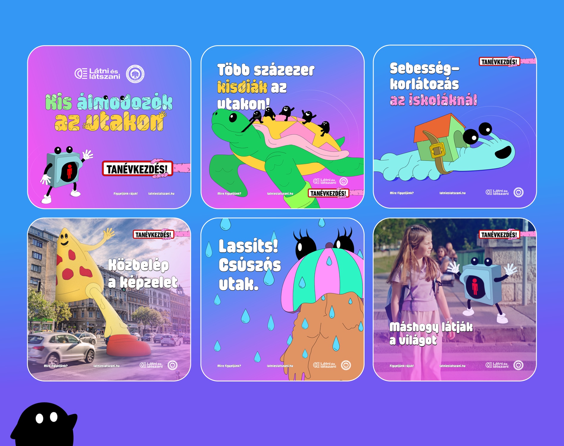
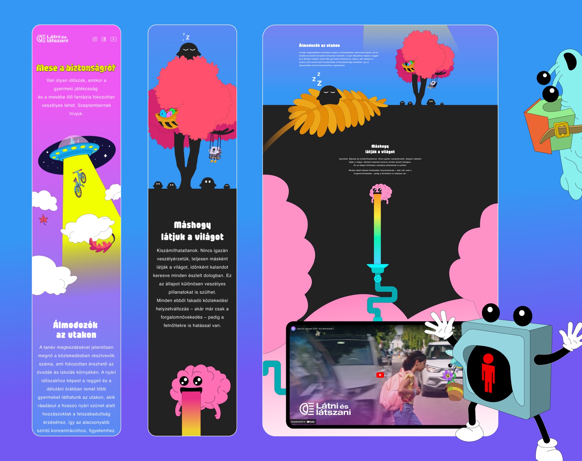
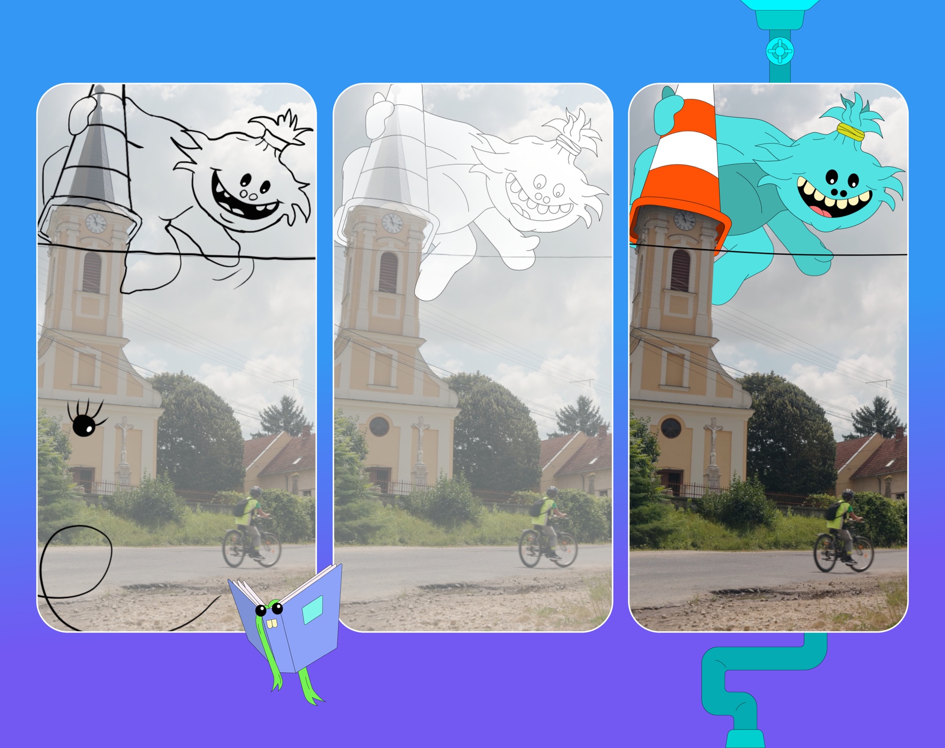
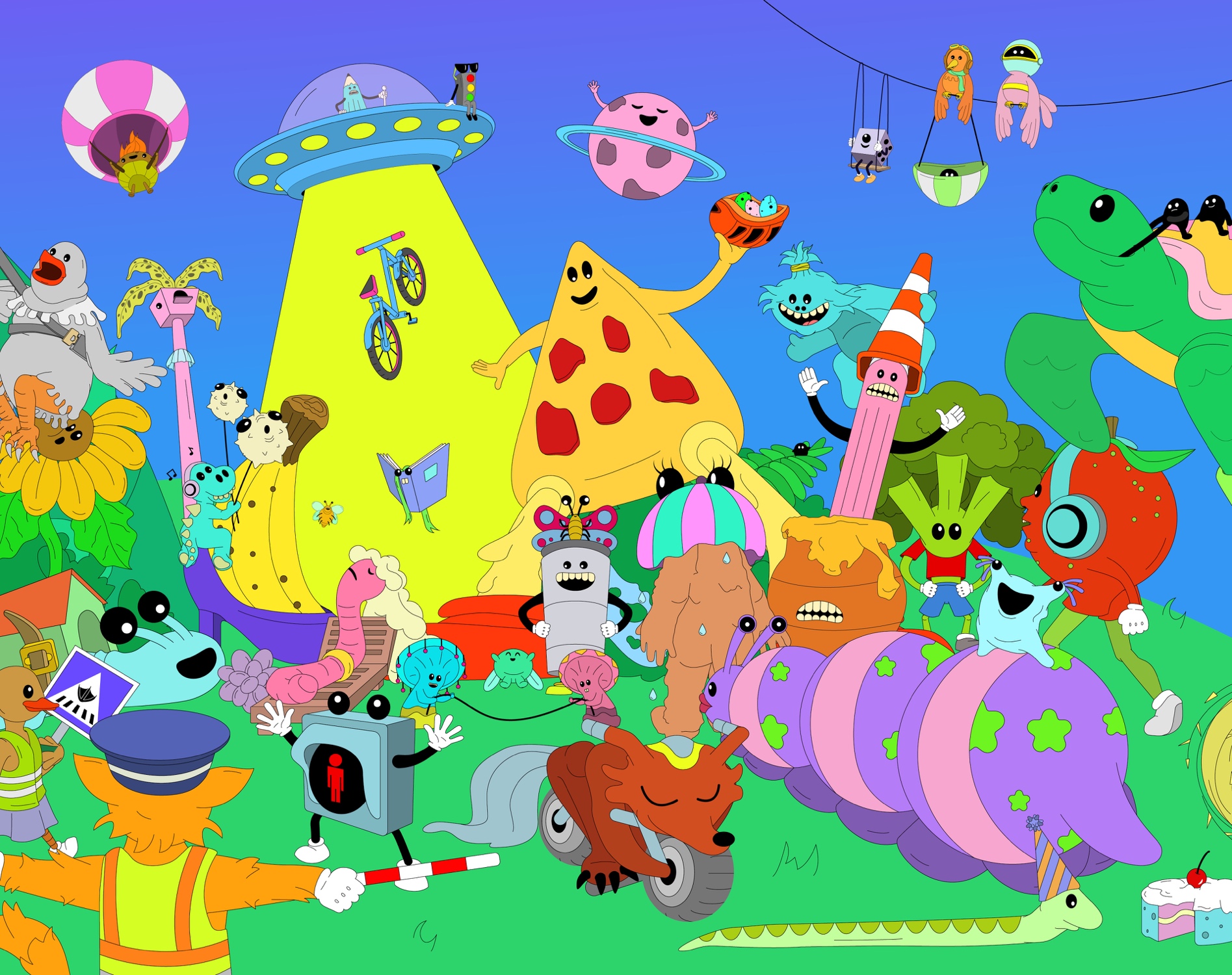
The task.
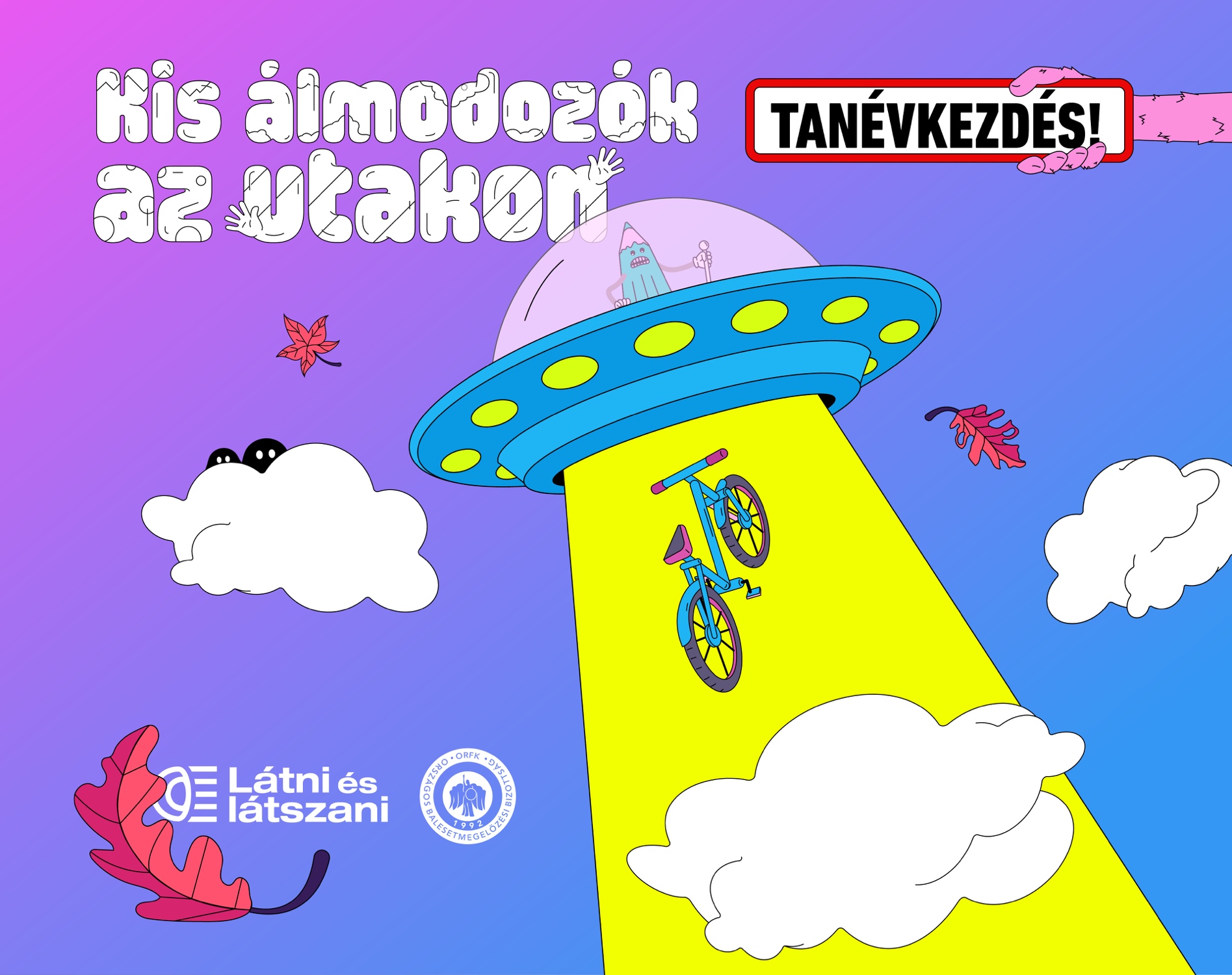
Development of the 2024 back-to-school creative concept for the "Látni és látszani" campaign.
The implementation.
The "Little Dreamers on the Road" concept is built on the idea that children see the world from a different perspective — playfully and without a sense of danger. Real-life traffic situations were complemented with imaginative illustrated characters to make this viewpoint relatable for adults as well, strengthening awareness and responsibility.
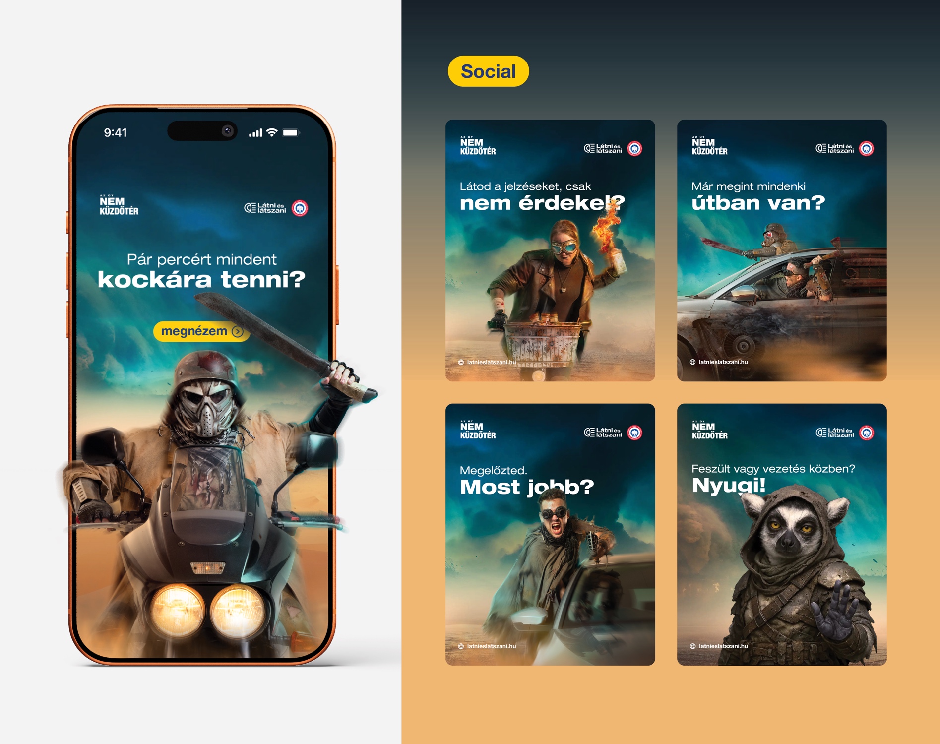
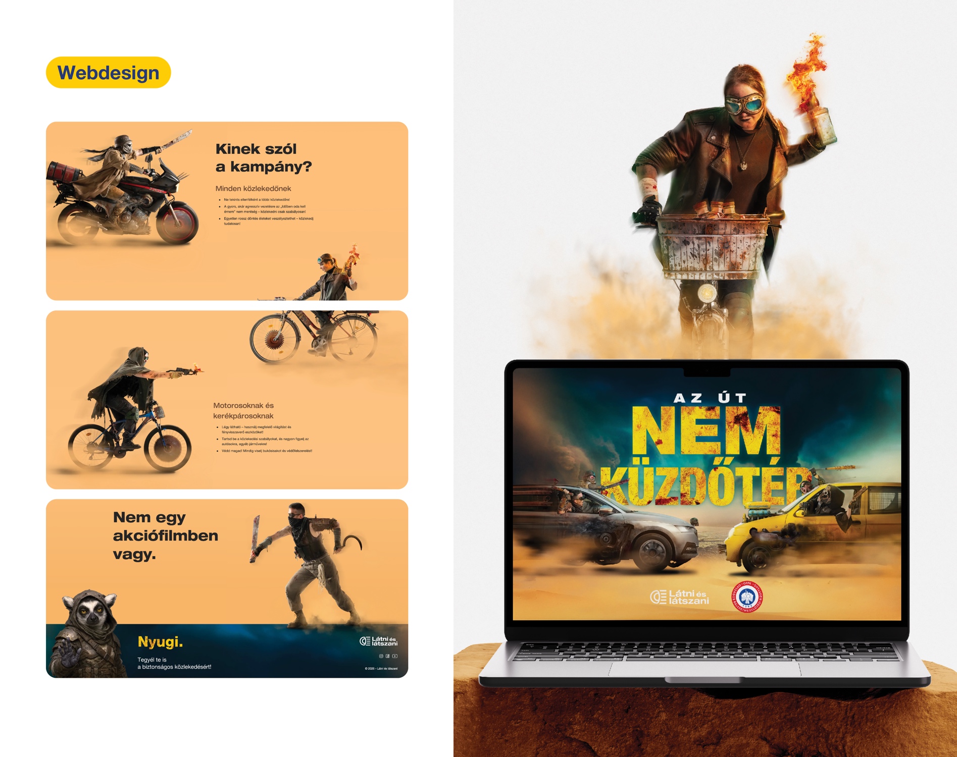
The task.
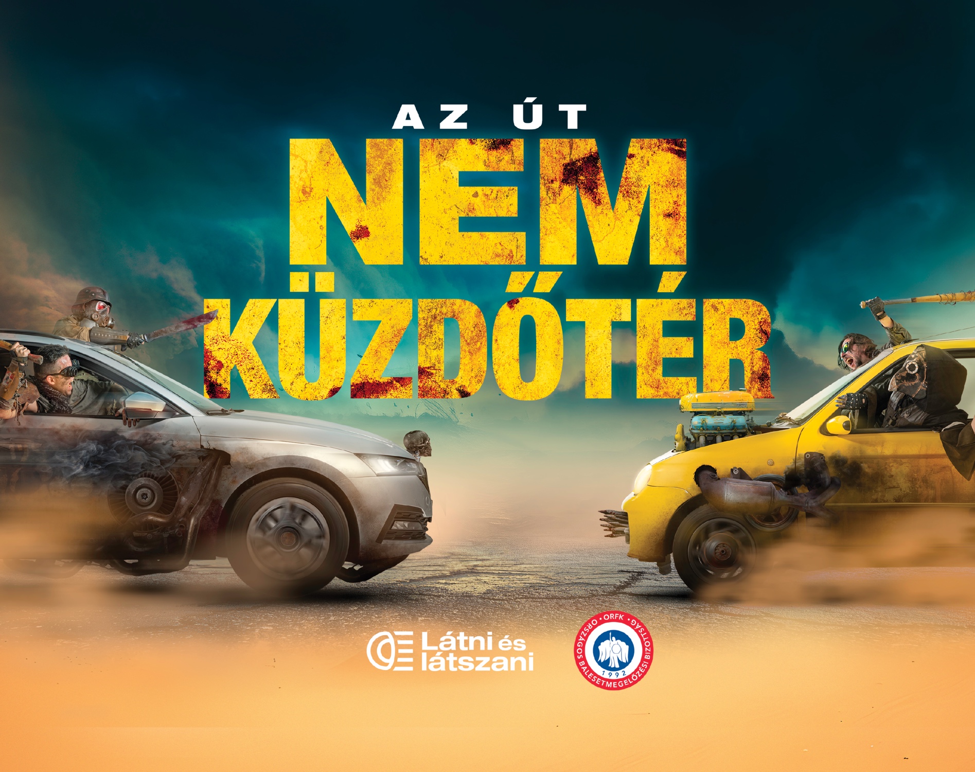
Creation of a creative concept within the "Látni és látszani" campaign to highlight the dangers of aggressive, emotionally driven driving.
The implementation.
The "The Road Is Not an Arena" concept portrays traffic in a Mad Max-inspired, post-apocalyptic style. Through visual exaggeration, it highlights how absurd it becomes when driving turns into a race or a battle.
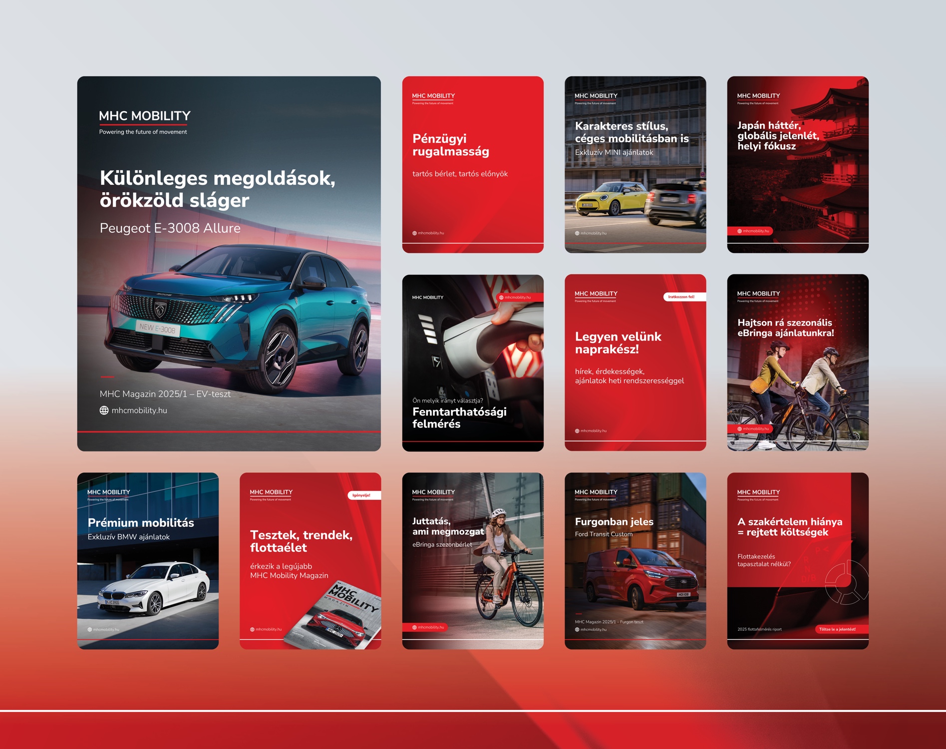
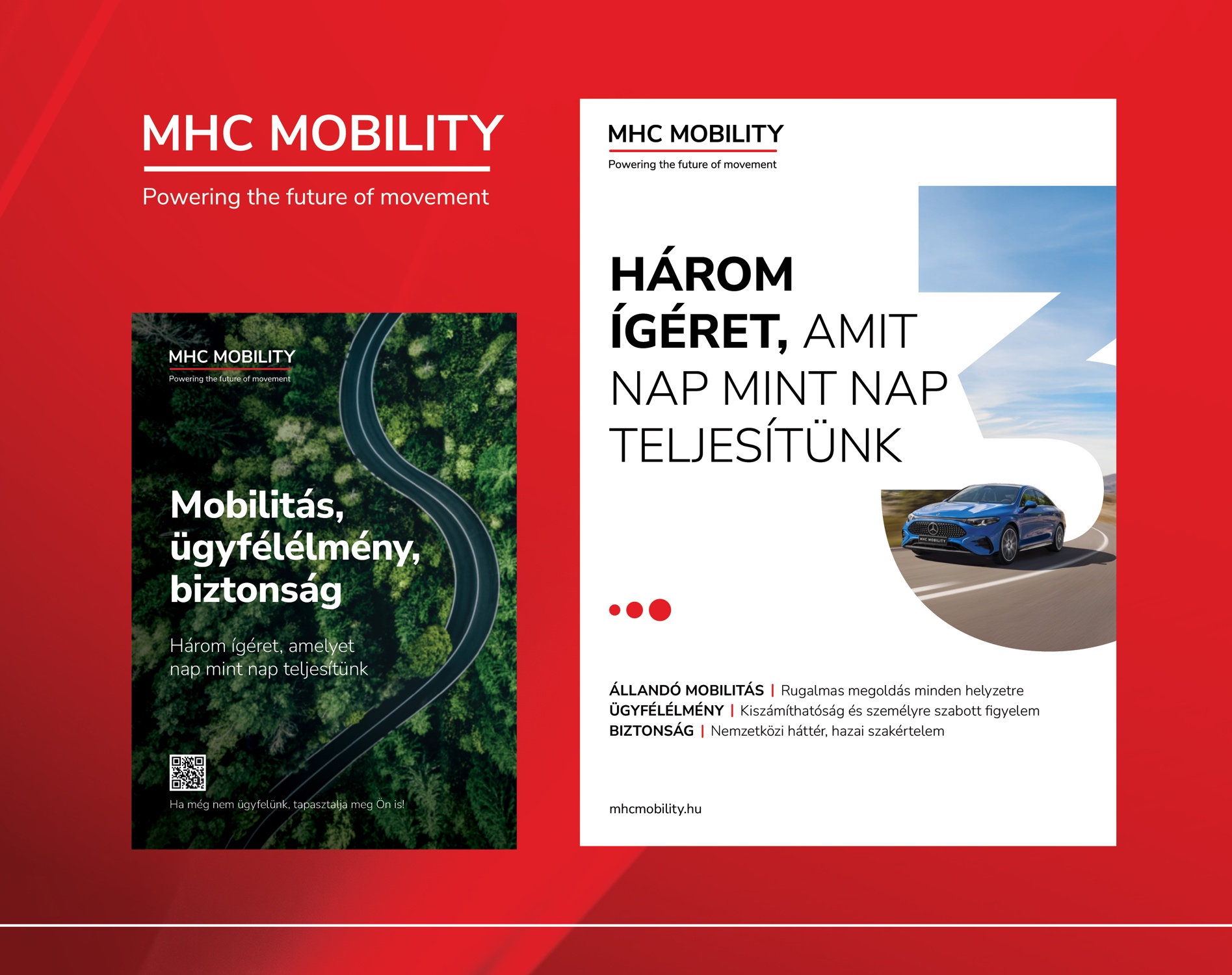
The task.
Supporting MHC Mobility's brand communication across OOH, print and digital platforms.
The implementation.
The communication centered around the triple promise of mobility, customer experience and safety. Through the consistent application of the visual system, we built a strong and recognizable presence across both offline and online platforms — supporting both sales and brand-building goals.
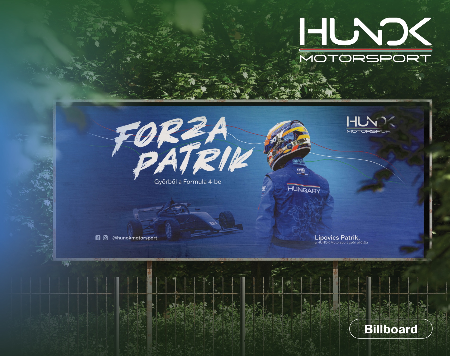
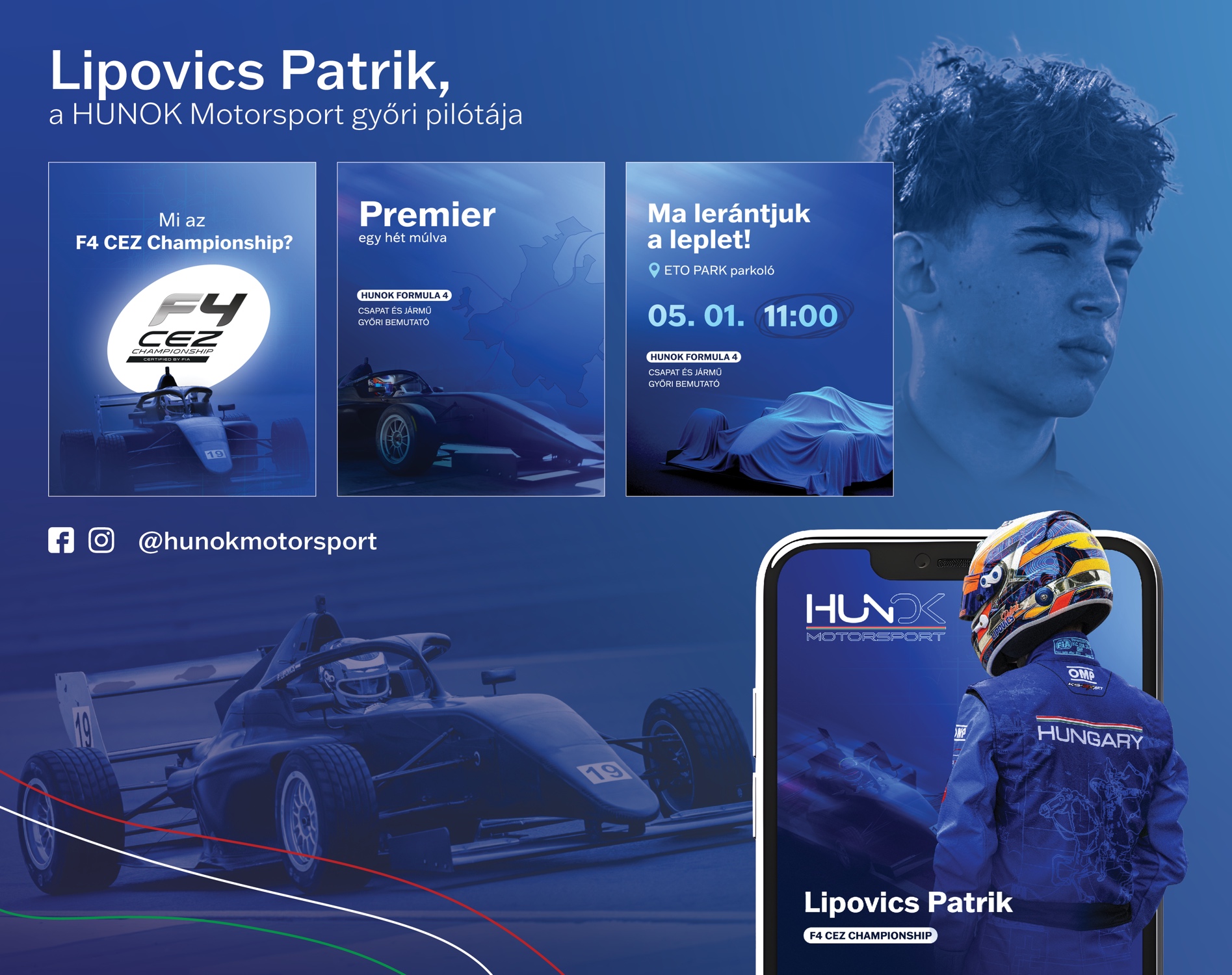
The task.
Establishing a communication foundation for Lipovics Patrik's F4 debut and new race car launch in Győr, positioning HUNOK Motorsport for the long term.
The implementation.
The project began with the development of HUNOK Motorsport's complete brand design, creating a unified visual foundation for the driver and the team. Based on this, we implemented the full communication of the F4 debut in Győr through billboard, social and digital executions.
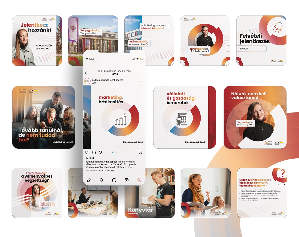
The task.
Promote the Audi Hungaria dual vocational training at a national level.
The implementation.
In addition to the high-level training and educational environment, it's human connections that we emphasize to take the learning experience to a new dimension. And where do we achieve this? Of course, on social media.
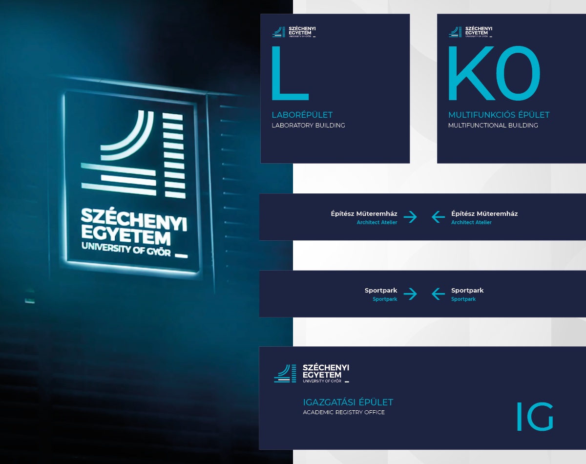
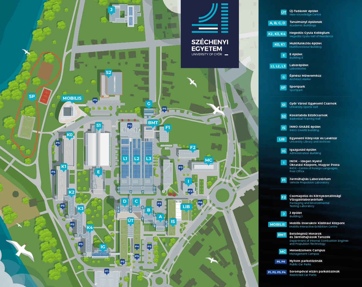
The task.
After the updated branding and due to the expansion of the campus, the institution requested a comprehensive signage system.
The implementation.
Cut and printed facade signs, as well as standalone signs that illuminate after dark, assist in easy navigation throughout the campus area.


